The 1564 edition is the first by the Venetian typographer Sessa. Upon humanist Francesco Sansovino’s initiative the volume came out as an imposing folio format, with XXVIII+392 leaves and 97 woodcuts reproducing those commissioned by Marcolini for his 1544 edition. The text is the one reviewed by Bembo for the 1502 Aldine in-8vo edition.
Here was the challenge for Sansovino and Sessa. Competing with both the first pocket and minimalist edition of Dante with a text immediately winning the favor of philologists and the innovative comment by Vellutello of the 1544 edition. Why venturing against the odds by reprinting Dante after such prestigious predecessors?
The success of the Marcolini edition with Vellutello’s comment, reigniting the audience’s interest for the Commedia’s exegesis, pushed Sansovino and Sessa to courageously conceive a product to enter a market niche. The return to the medieval/incunabula large format (in-folio) and the insertion of a large system of notes and explanations wanted to offer an elegant edition where the reader could find all what was written and said about Dante up to then.
Joining the two most appreciated comments, by Landino (first 1481) and Vellutello (first 1544) was not done before, probably for the diverse nature of the two approaches: more allegorical and prone to digression the first, more incline to facilitating the reading the latter.
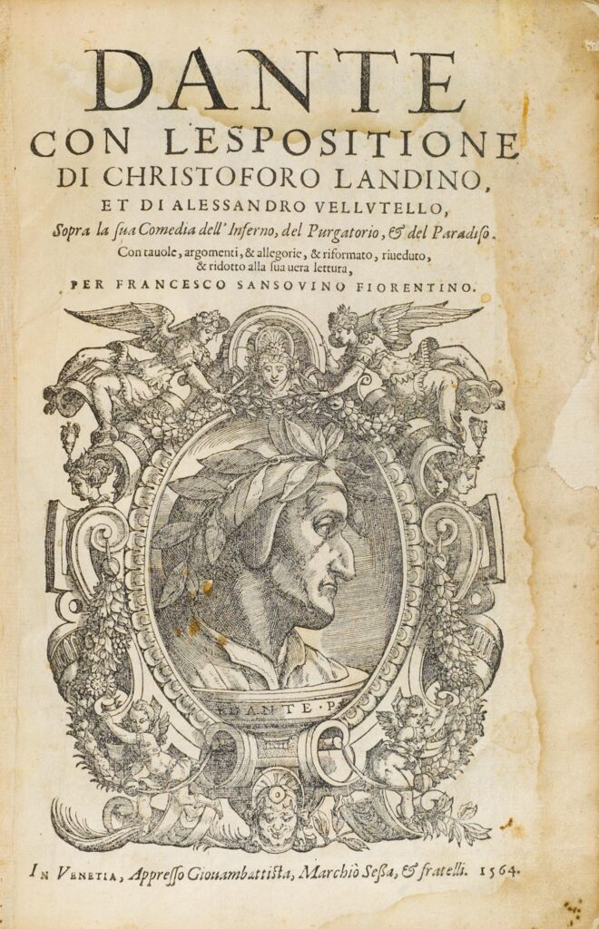
The title page highlights the elements on which Sansovino tended to leverage to promote its own edition and to justify the placing on the market of a new book product. First of all, the emphasis on the name of Dante, and not on the title of the poem, which from the 1545 Ludovico Dolce edition (publisher Giolito de’ Ferrari) had instead been brought back to the center of attention by the attribution of the adjective “divine”. Worth noting though that the name of the poet stood out in a prominent position on the title pages of the second Aldus edition (1515), of the “Dantino” of Paganino (1516) and of all the Lyon editions.
The large space devoted to the portrait of Dante, on the same title page, concurs to the centrality of the figure of the poet filling more than half of the page. It is a framed laurel medallion inside which Dante is represented from the side and with a prominent nose – so much so that the edition was known as «of the big nose». The iconography seems to reflect the physiognomy attributed to the poet in the famous portrait of Bronzino. The reader seems therefore invited to immediately deal with the figure of the author.
Except from the three full-page woodcuts, preceding each cantica, the smaller engravings are designed according to well recognizable schemes: those of the Inferno are characterized by the circle, often inserted in a squared frame while the scenes represented are seen from above; in the Purgatorio the prevailing scheme is a truncated cone; in Paradiso the circle represents the astral body, surrounded by rays of light and flames.
Completely innovative if compared to the previous iconographic tradition, the 97 illustrations are not an artistic representation of scenes inspired by the text, but represent visually Dante’s journey, as a continuation of the comment and with constant attention to the Comedy’s topography.
The outcome of the typographic gamble was a success for the years to come allowing the Sessa to reprint the edition, with minimal corrections, in 1578 and in 1596.